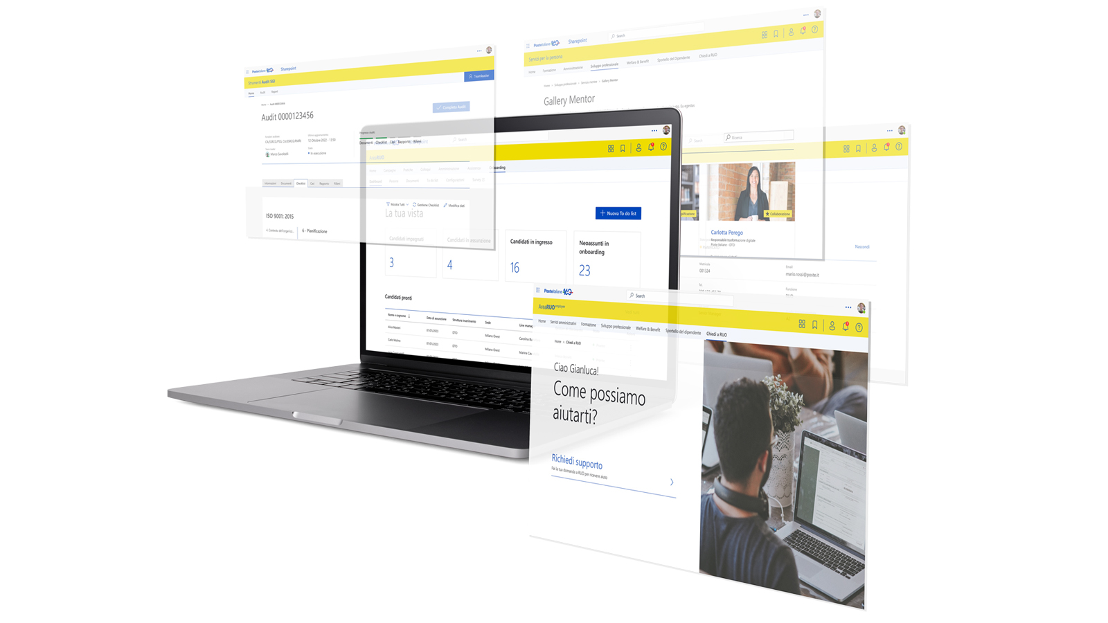
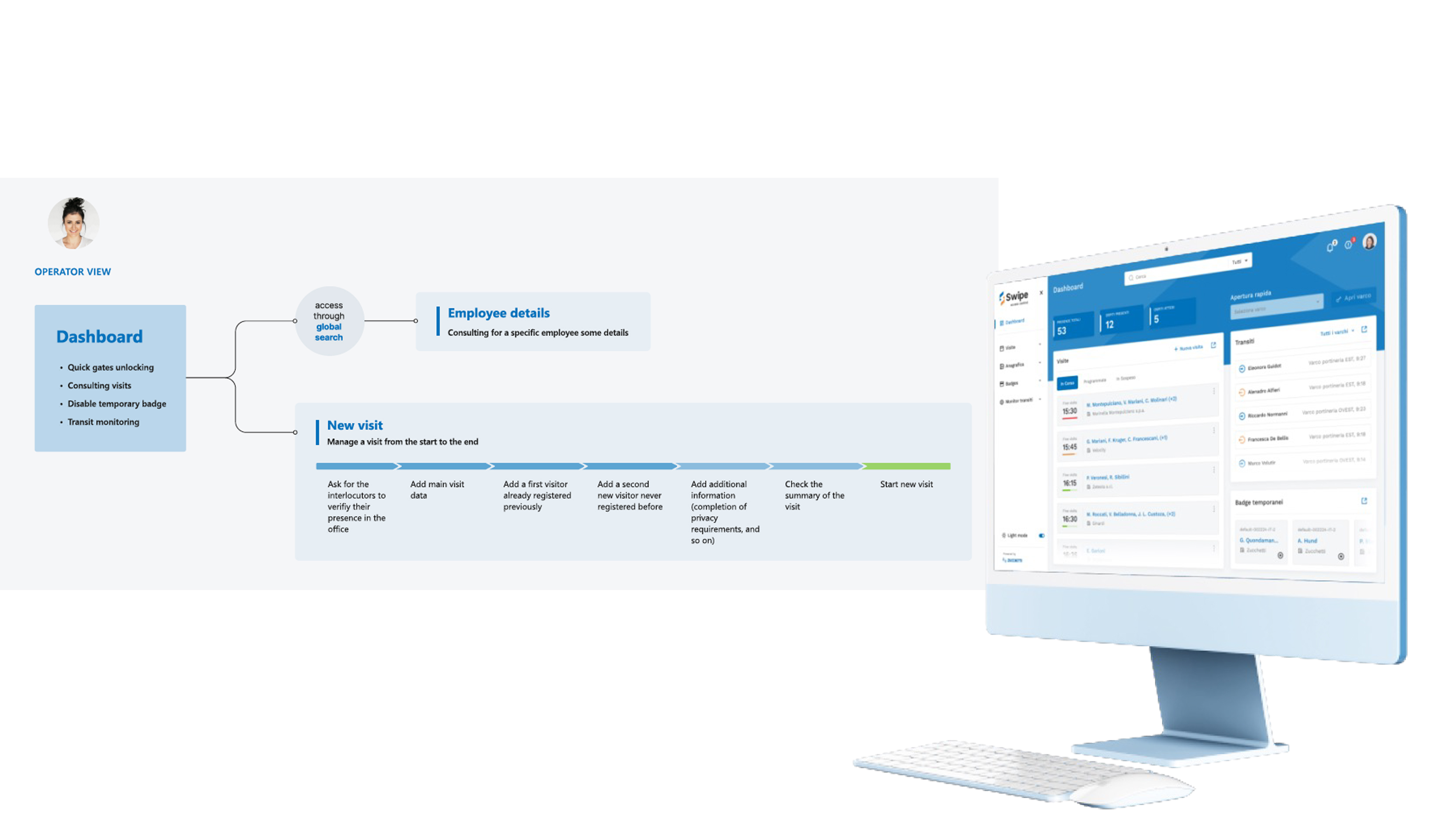
Access Management
& Process Digitalisation
A strategic digital transformation initiative: replacing a patchwork of legacy systems, ad-hoc tools, and manual Excel-based processes with a unified platform built on ServiceNow. The organisation managed critical access and operational workflows across disconnected systems — each with its own logic, permissions model, and user interface. The business case was clear; the design challenge was translating years of fragmented operational knowledge into a coherent, scalable digital product that users would actually adopt.
Product Context
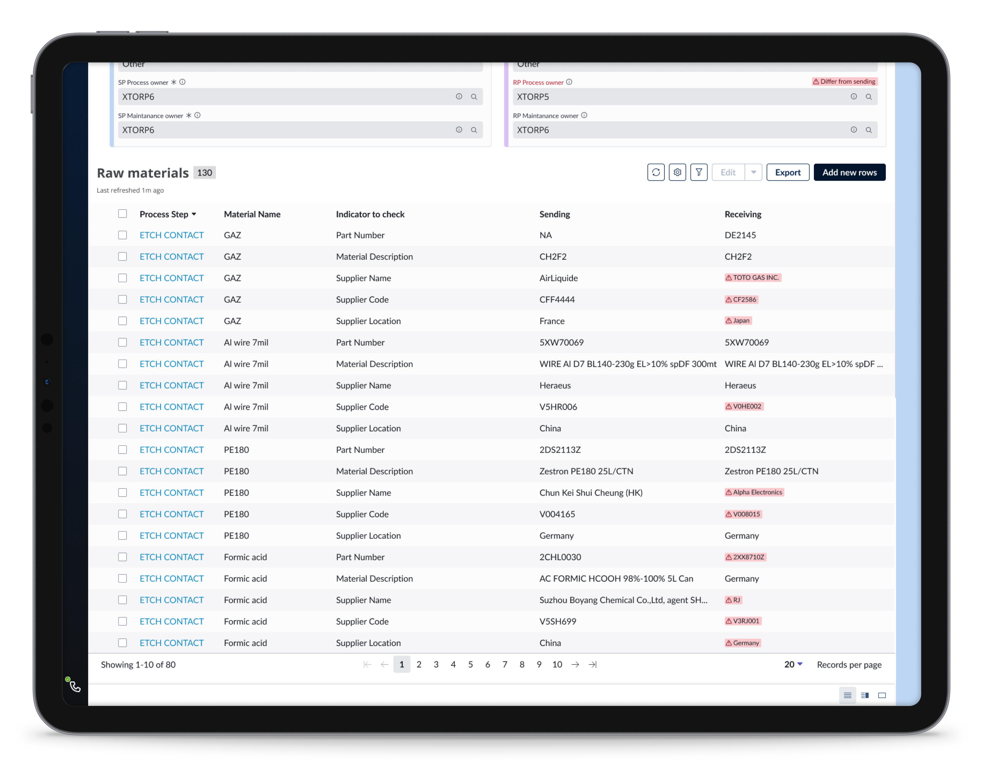
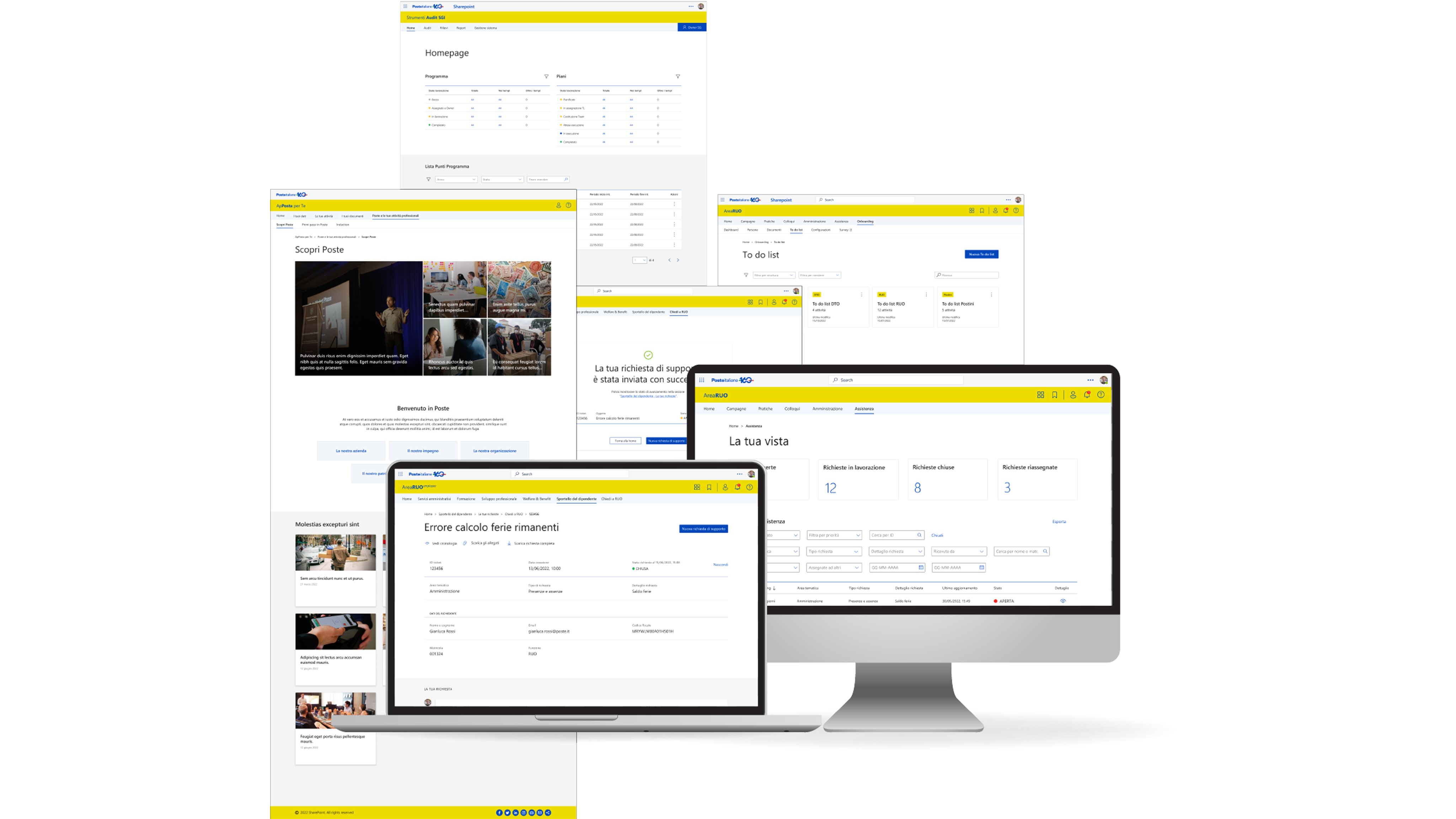
The platform was used internally by a large enterprise organisation to manage access, permissions, and operational workflows — previously spread across legacy tools, bespoke applications, and manual Excel-based processes.
Users included operators, managers, and administrative staff working daily on the system. The product had evolved over several years, resulting in fragmented processes, inconsistent navigation, and limited scalability. Because it was business-critical, any change had to be introduced without disrupting existing operations.
Constraints
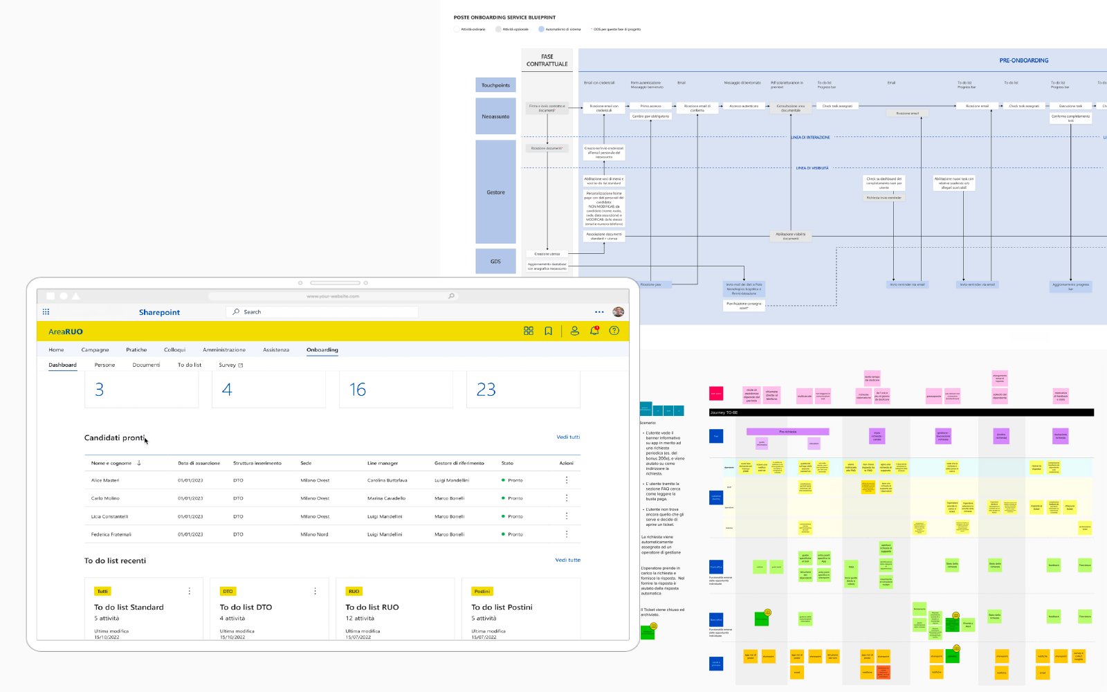
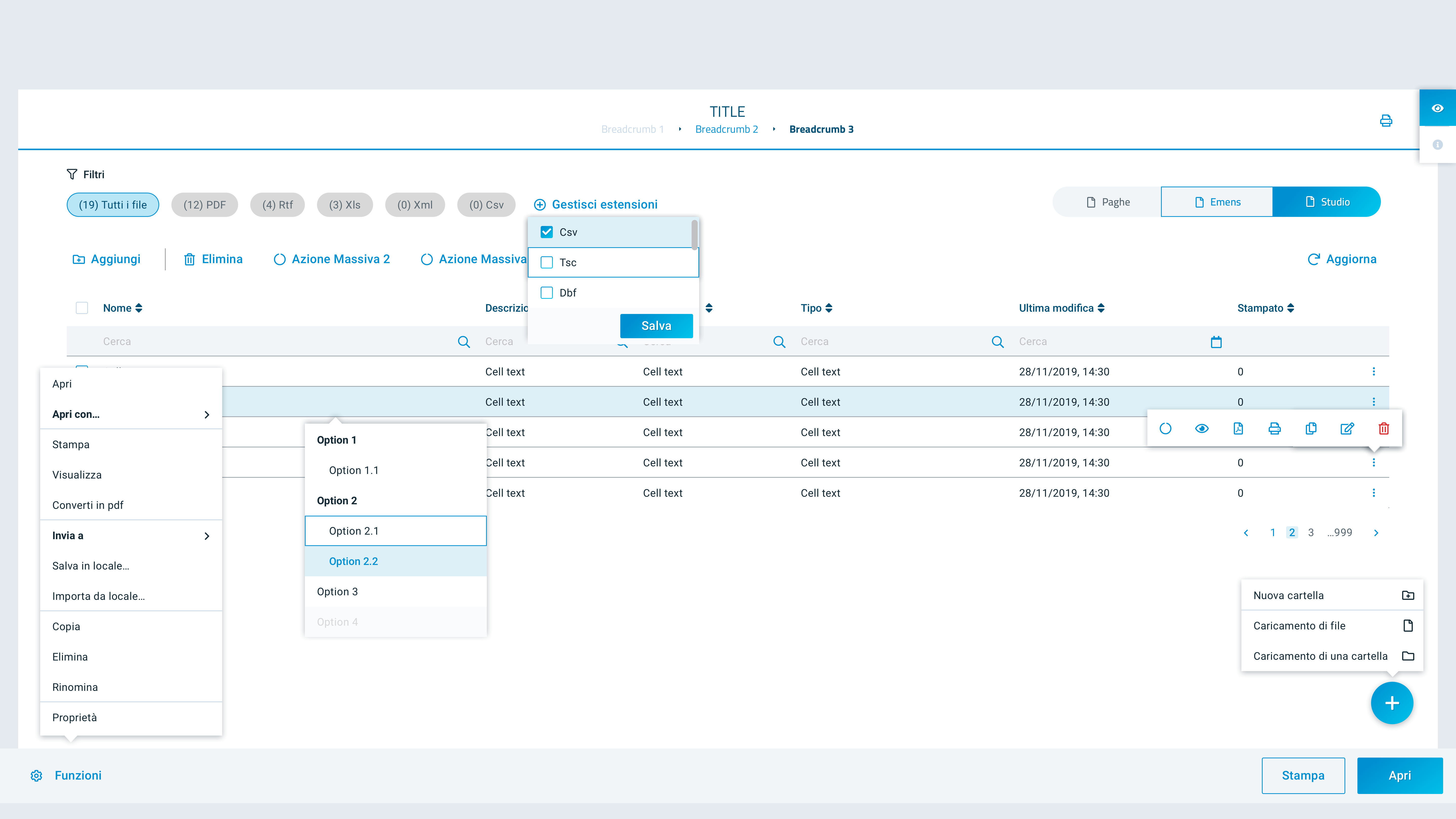
The redesign had to work within an existing enterprise architecture and ServiceNow platform. The backend logic could not be fully rewritten — the new UX needed to adapt to current data structures and permission models.
Different departments had slightly different workflows, but the experience had to remain consistent across all of them. Performance and stability were non-negotiable: the platform was used across the entire organisation, every day.
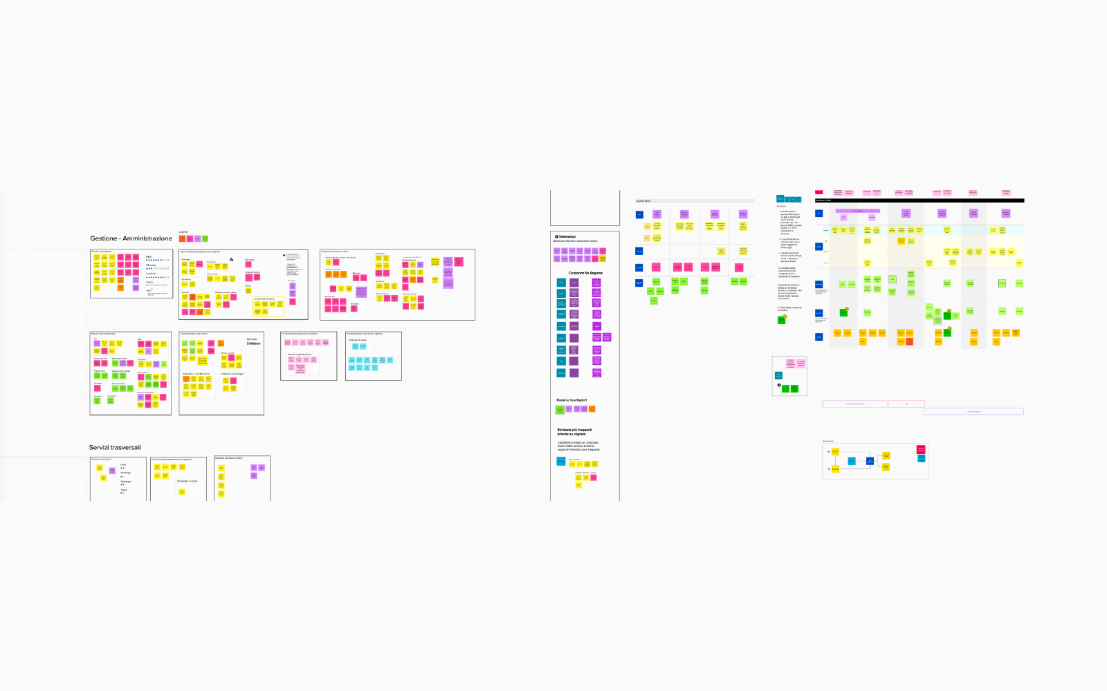
Problem
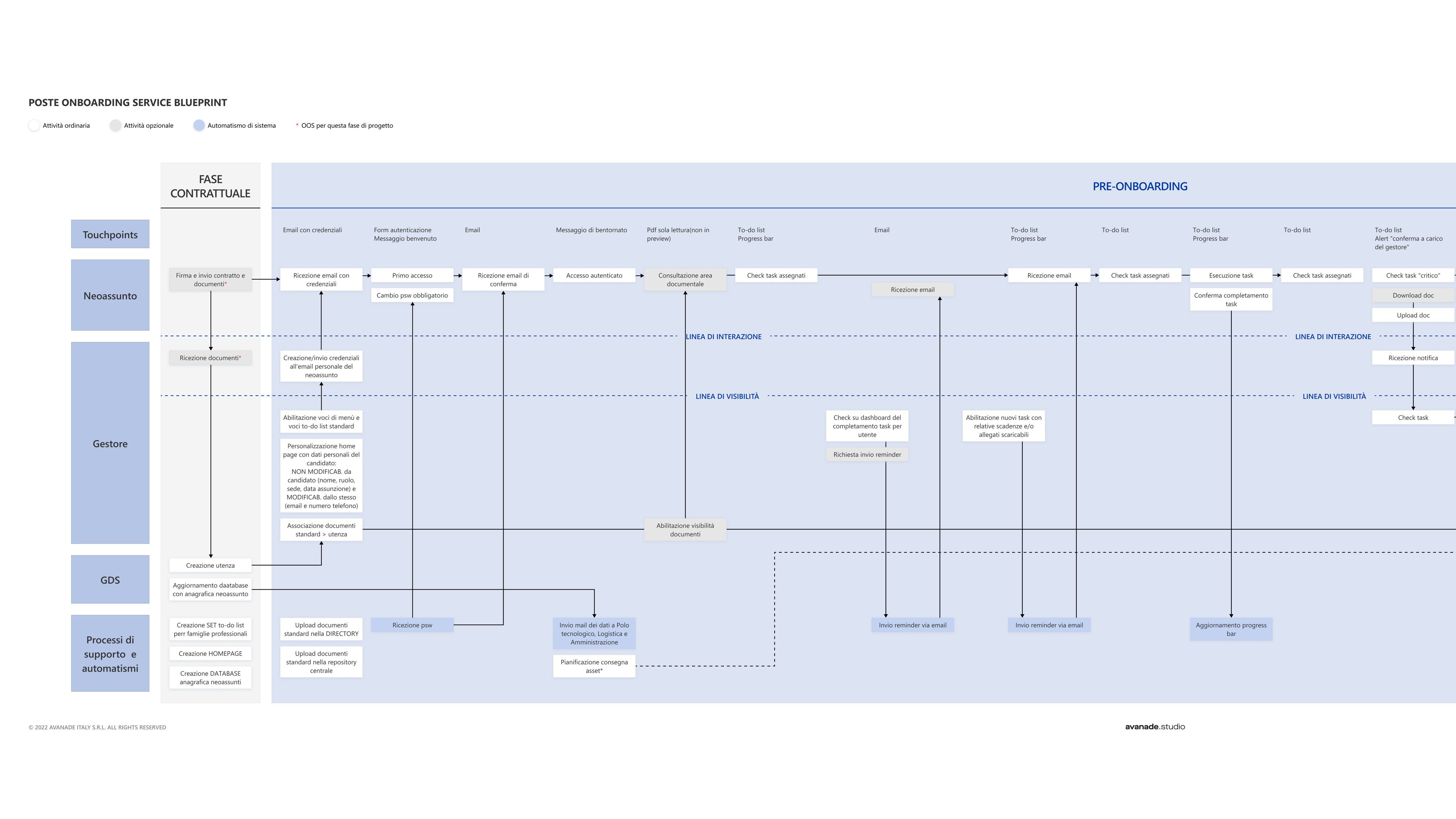
The organisation's operational processes were running on a fragile mosaic of legacy tools, bespoke applications, and manual workarounds — Excel files, shared drives, email threads, and systems built in isolation years earlier with no common architecture.
Process ownership was unclear, data lived in silos, and access management was handled inconsistently across business units. Any change to a workflow meant coordinating across multiple disconnected systems — the operational risk was significant, and the user experience reflected it.
“Years of operational complexity had been absorbed into the tools. The tools had become the process.”
My Role
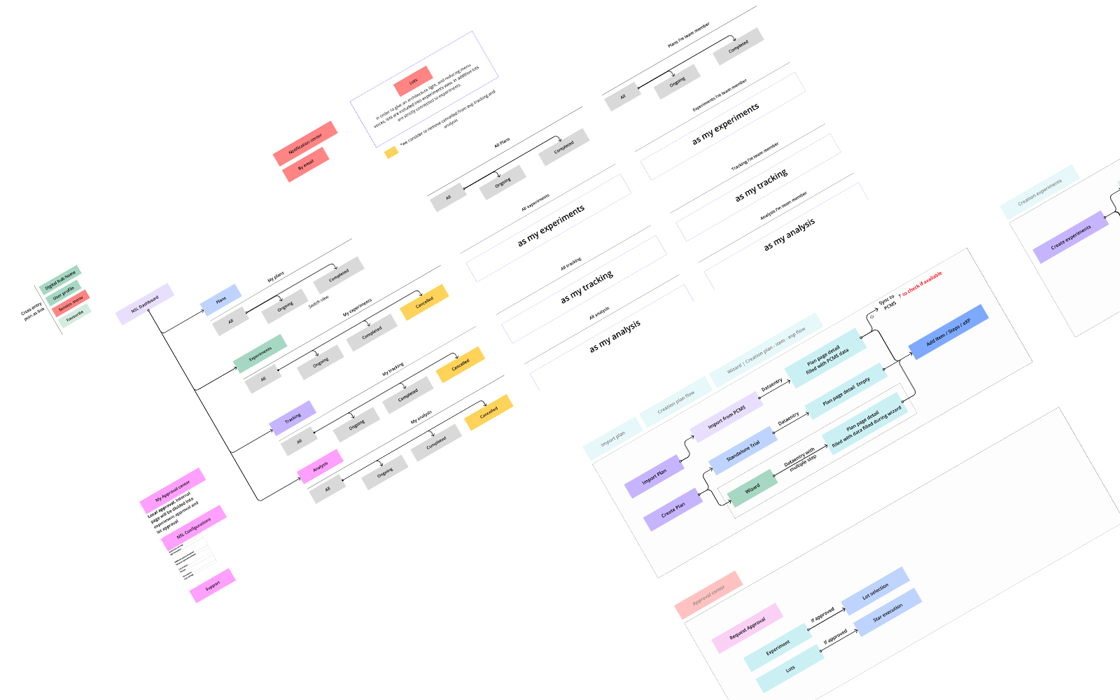
I led the UX workstream end-to-end, embedded with product owners, developers, and business stakeholders. I defined the interaction model, designed the navigation system, and ensured the solution could scale across different workflows.
I ran stakeholder workshops across multiple business units to surface tacit process knowledge, identify duplication, and define what “good” looked like before a single screen was designed. Working closely with the ServiceNow technical team, I translated complex workflow logic and permission models into interaction patterns that shielded users from underlying complexity while preserving power for administrators.
Trade-offs
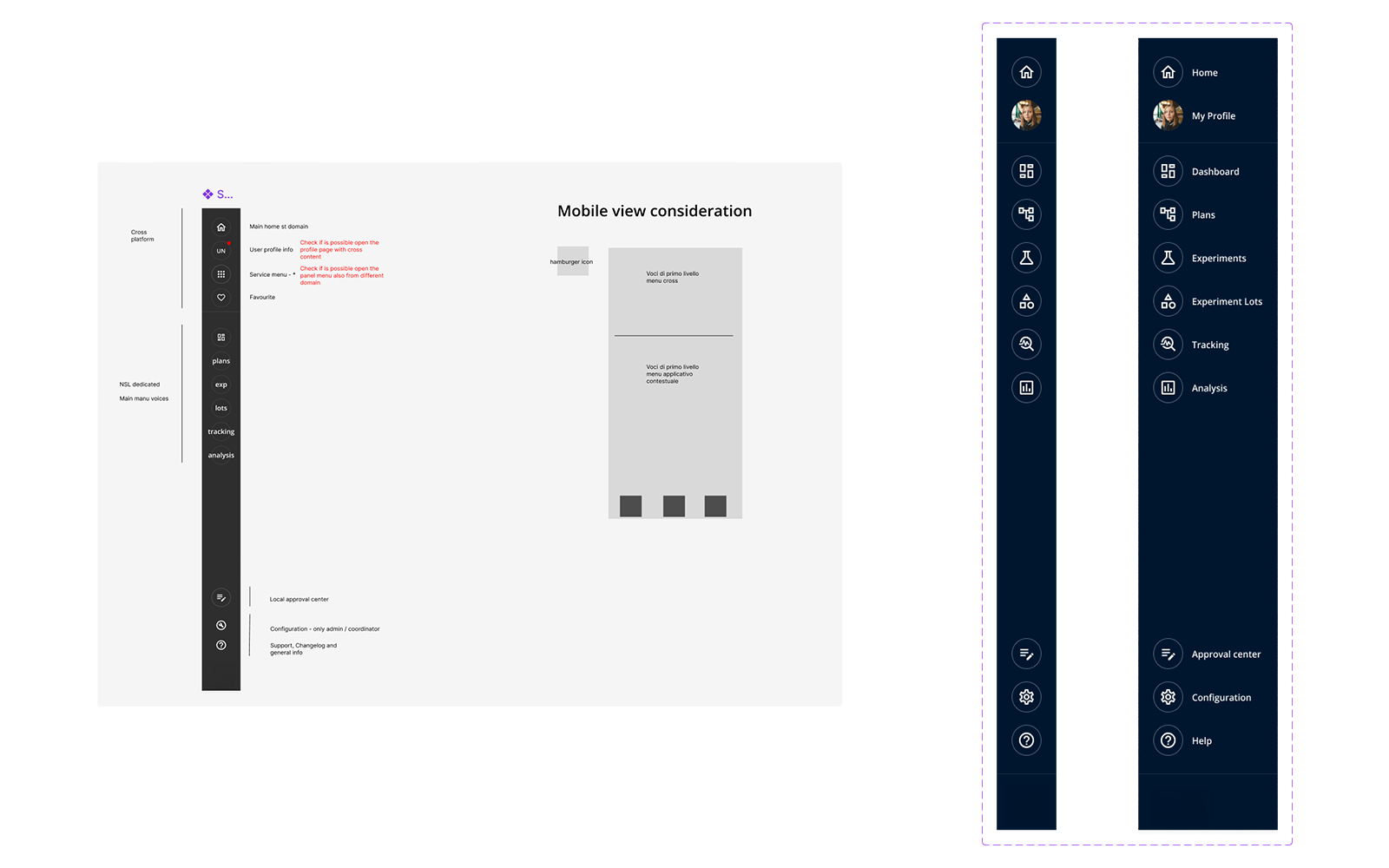
A full redesign of every system was not feasible, so we focused on improving navigation and interaction patterns first. We introduced a modular layout even where some legacy screens could not be fully updated.
We simplified workflows where possible, but kept validation steps required by the business. The goal was to improve usability without breaking existing logic — and to resist the pressure to simply replicate old systems in a new interface.
Iteration
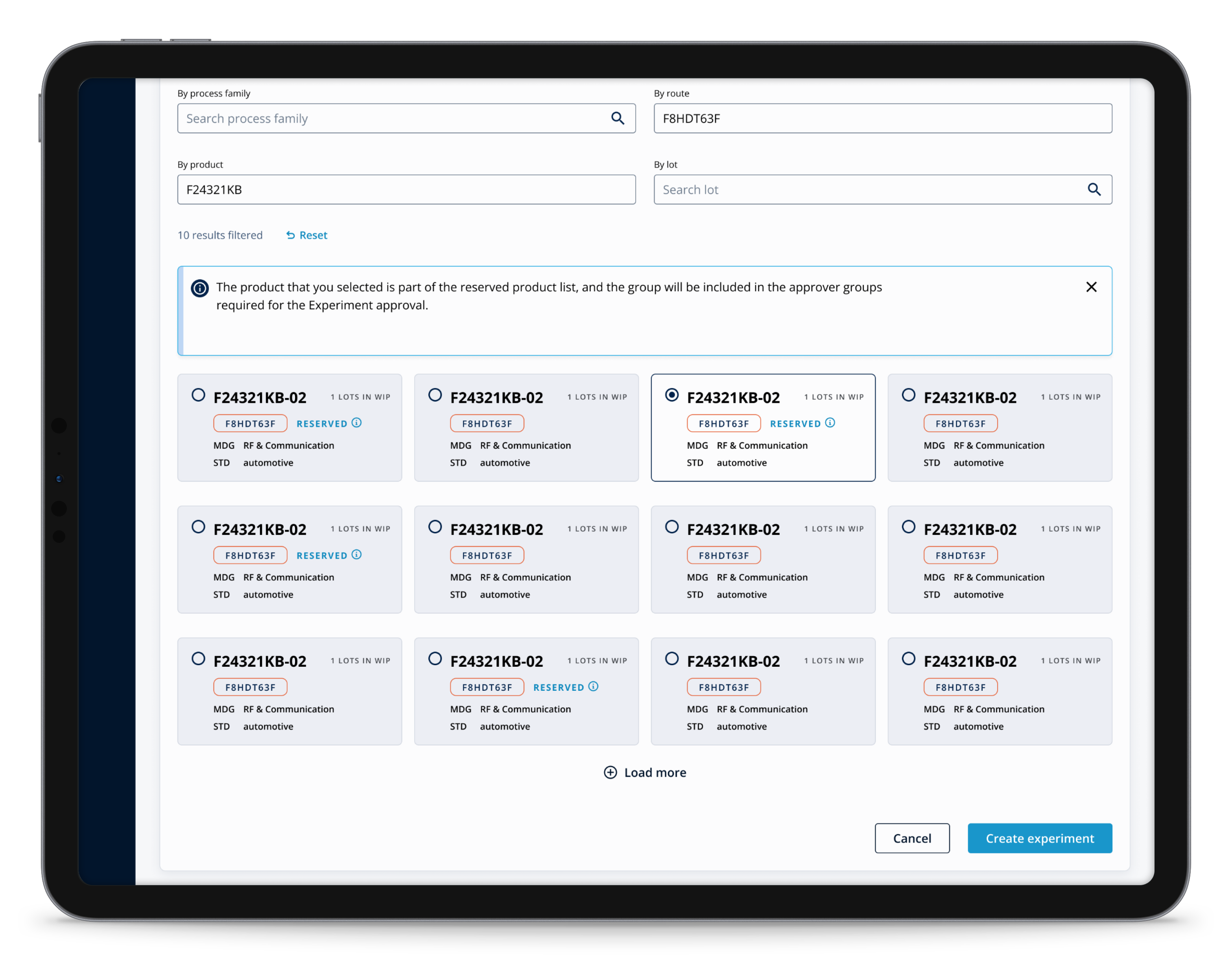
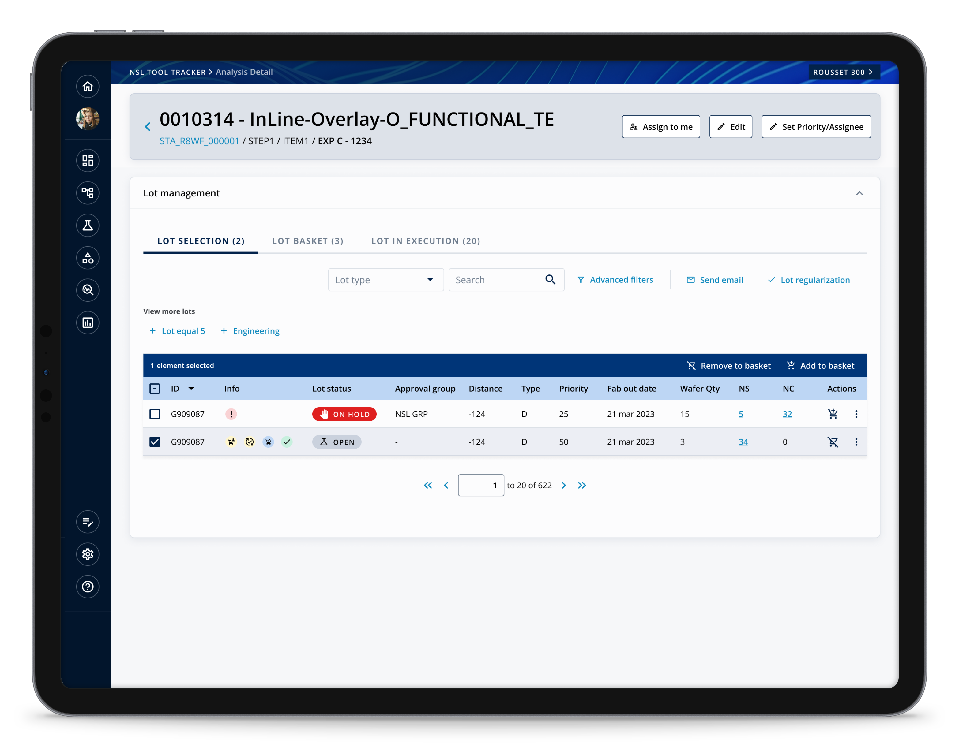
Early concepts were reviewed with internal users across roles. Operators requested faster access to frequent actions; managers needed better oversight of requests and statuses.
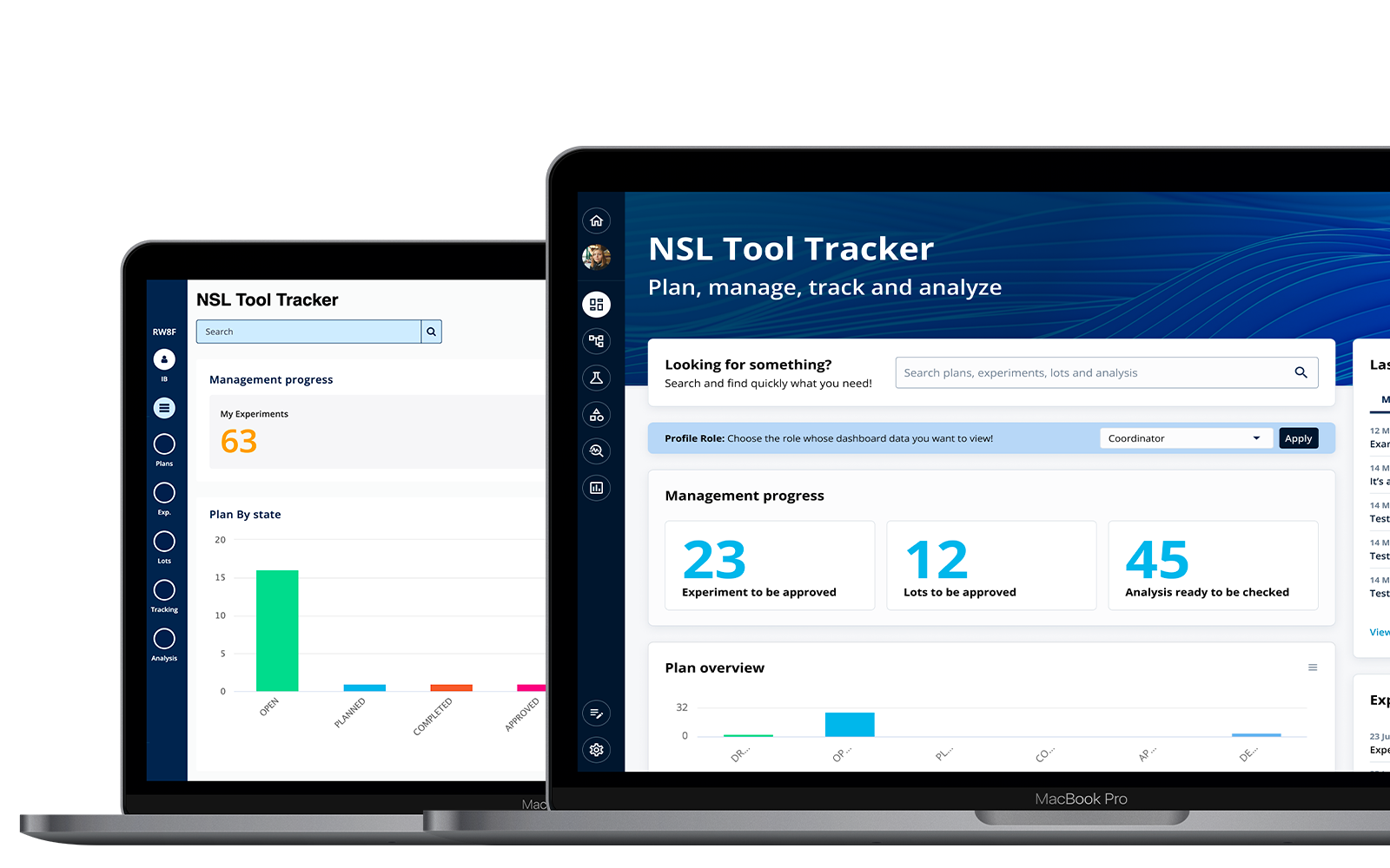
We refined the dashboard structure, added clearer status indicators, and simplified navigation between modules. Several iterations were needed to balance usability against technical constraints — each round informed by direct feedback from the people using the system daily.
Key Decision
The most critical design decision was resisting the instinct — from stakeholders and process owners — to replicate old systems digitally. The UX work was to challenge that, and redesign the underlying processes before designing any interface.
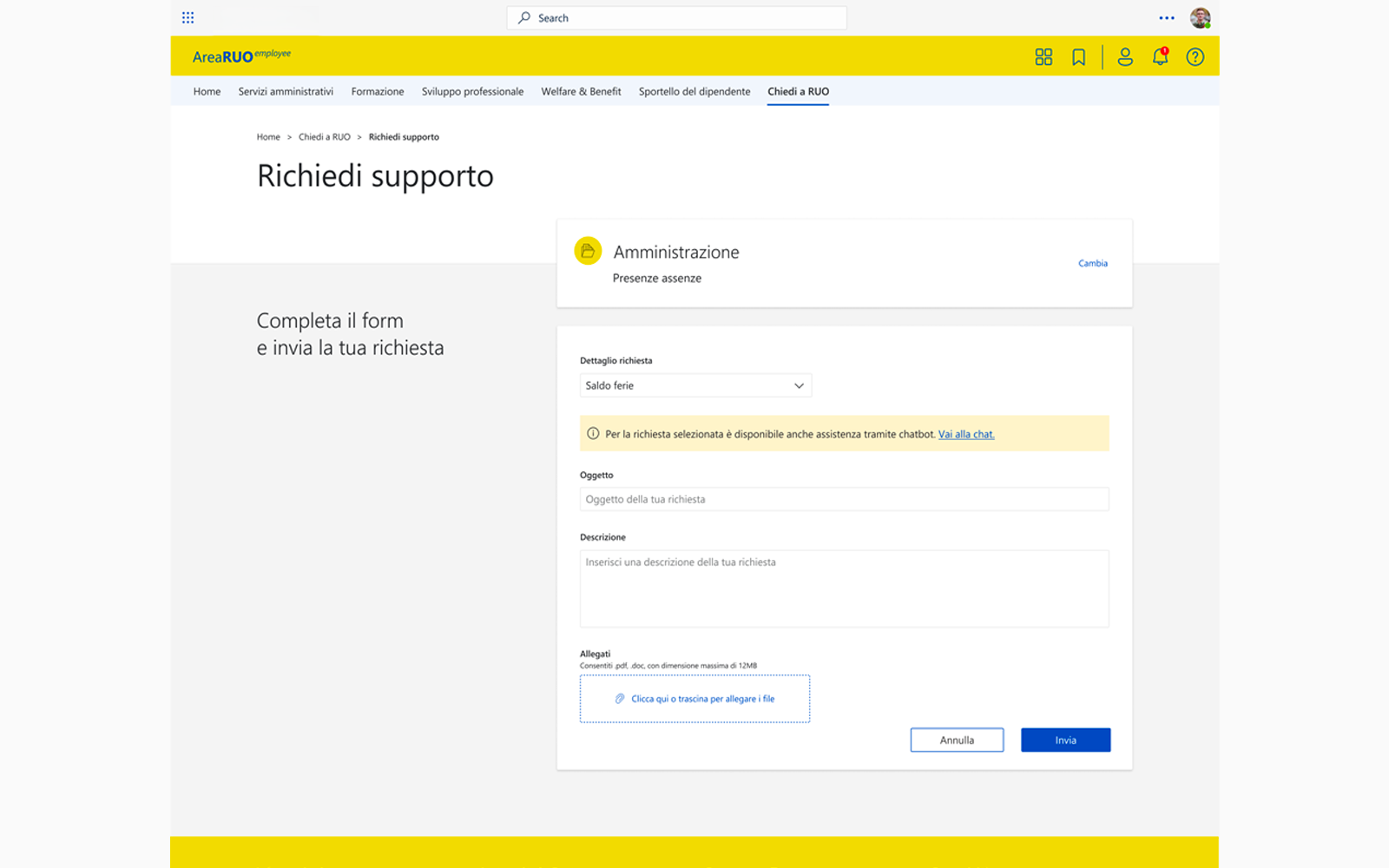
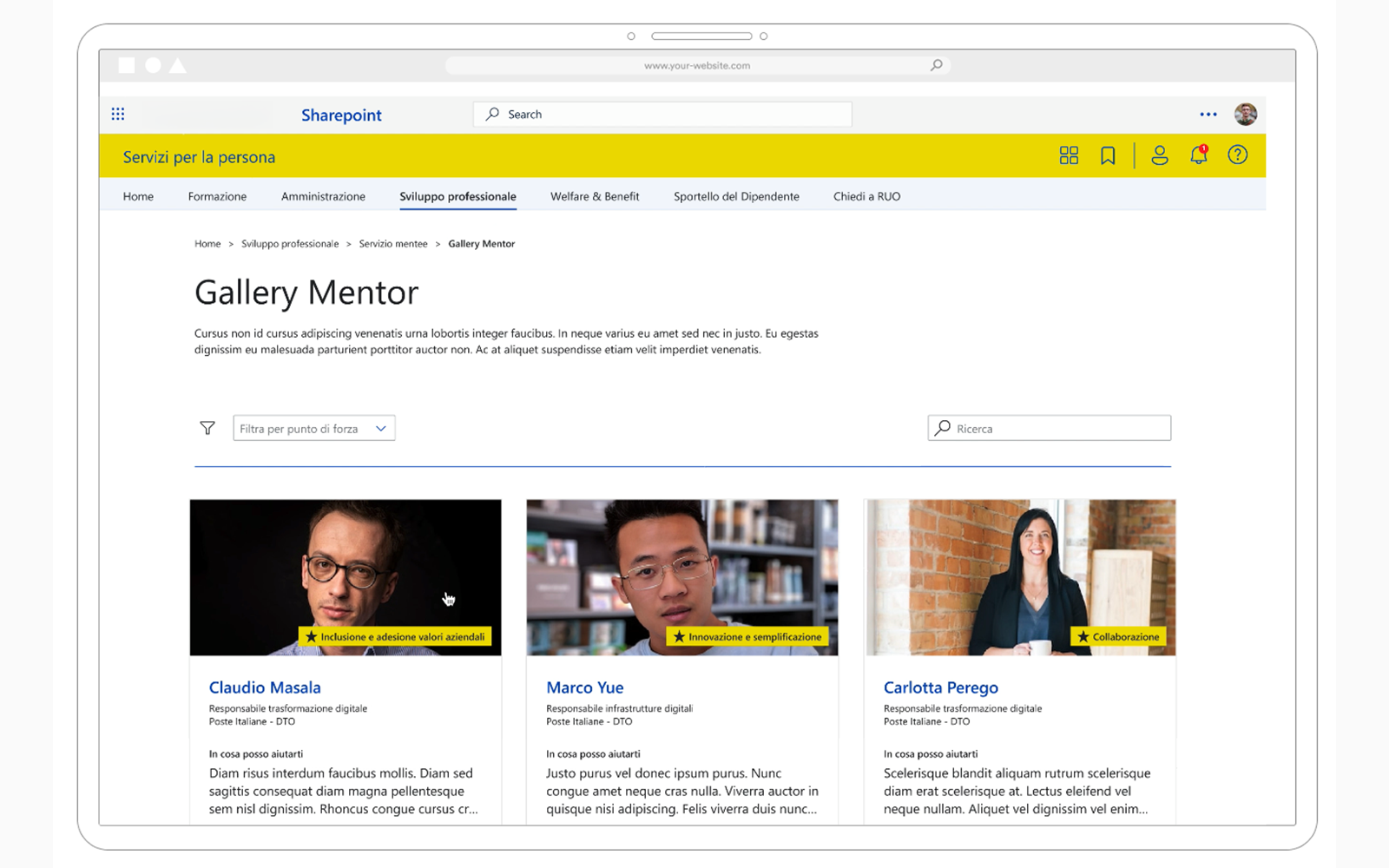
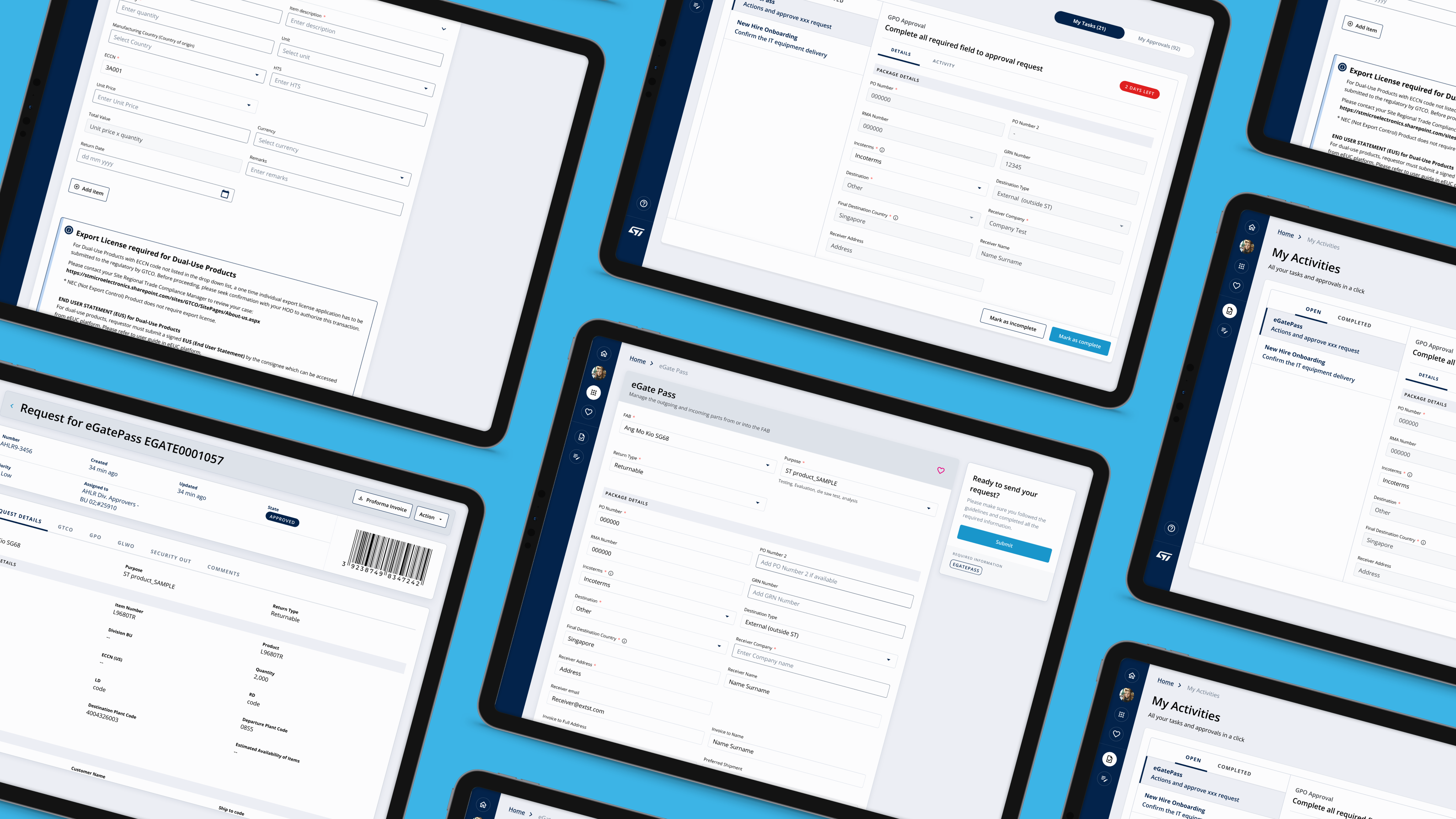
Access request flows were redesigned around user intent rather than system structure. Role-based dashboards replaced generic landing pages. Complex permission logic was abstracted behind progressive disclosure patterns — present when needed, invisible when not. Every component was tokenised and built to handle edge cases not yet on the roadmap.
Impact
The new structure reduced the time needed to complete daily tasks. Users reported better clarity when navigating between modules. The modular design allowed the product team to introduce new features without redesigning the entire platform — and became the foundation for future internal tools.
Ownership
I led the UX workstream for this project, working closely with product owners, developers, and business stakeholders.
I defined the interaction model, designed the navigation system, and ensured the solution could scale across different workflows and future process additions.
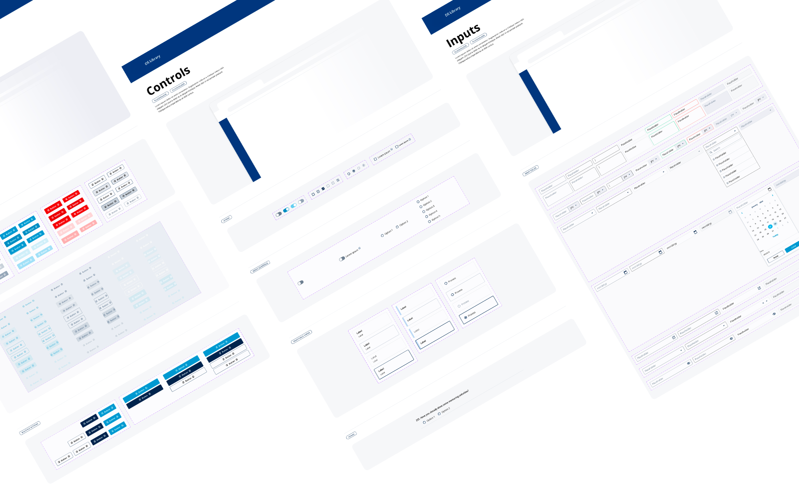
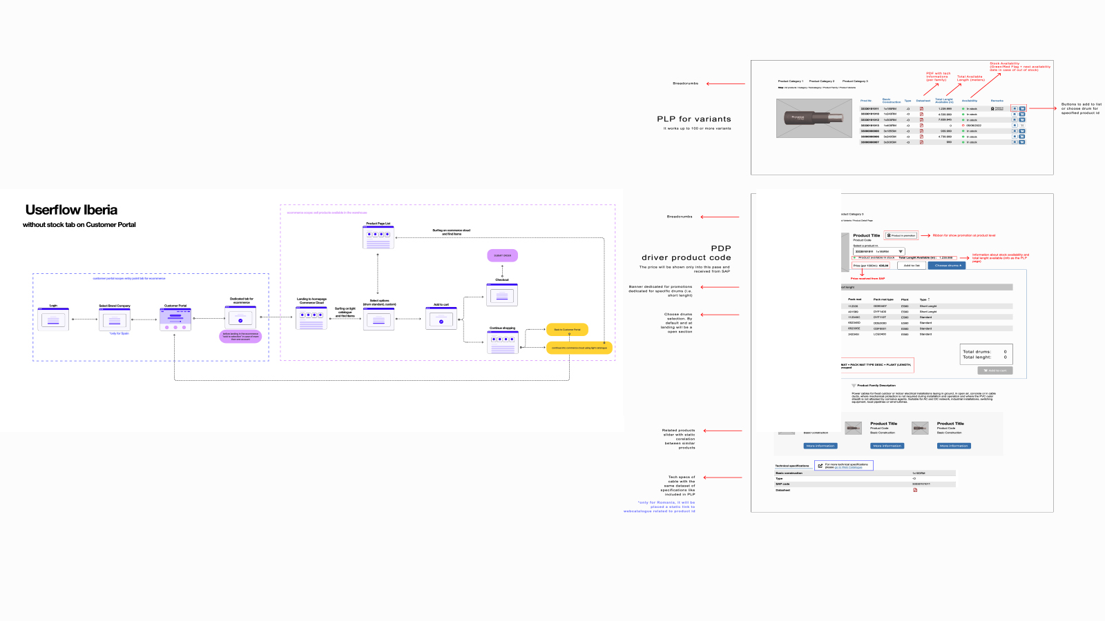
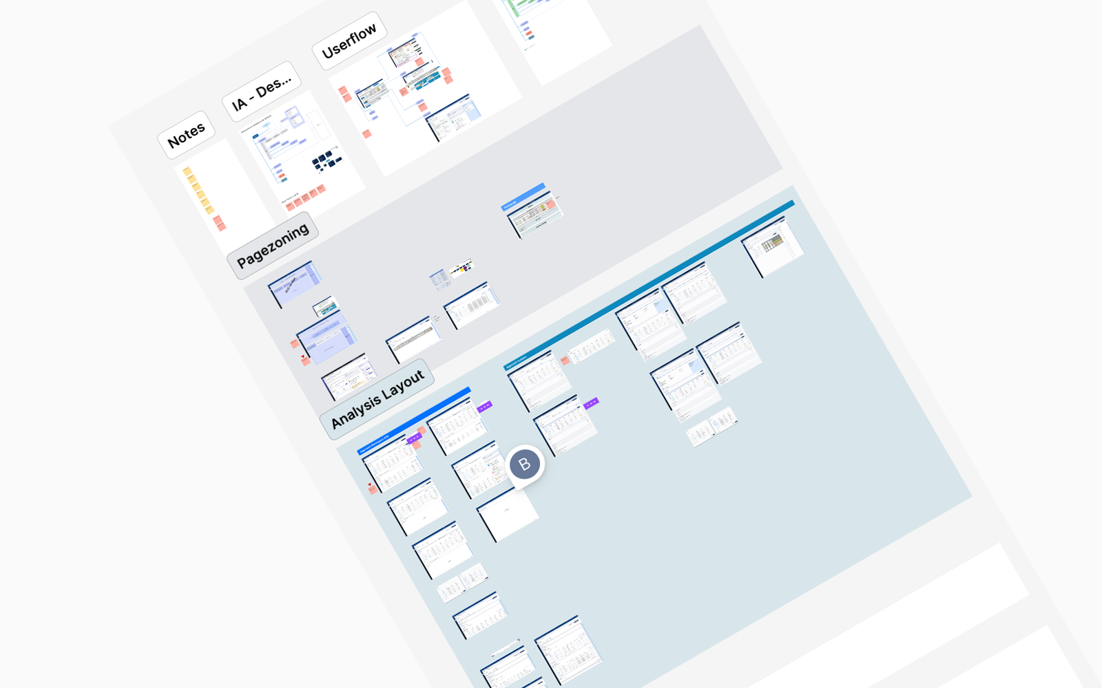
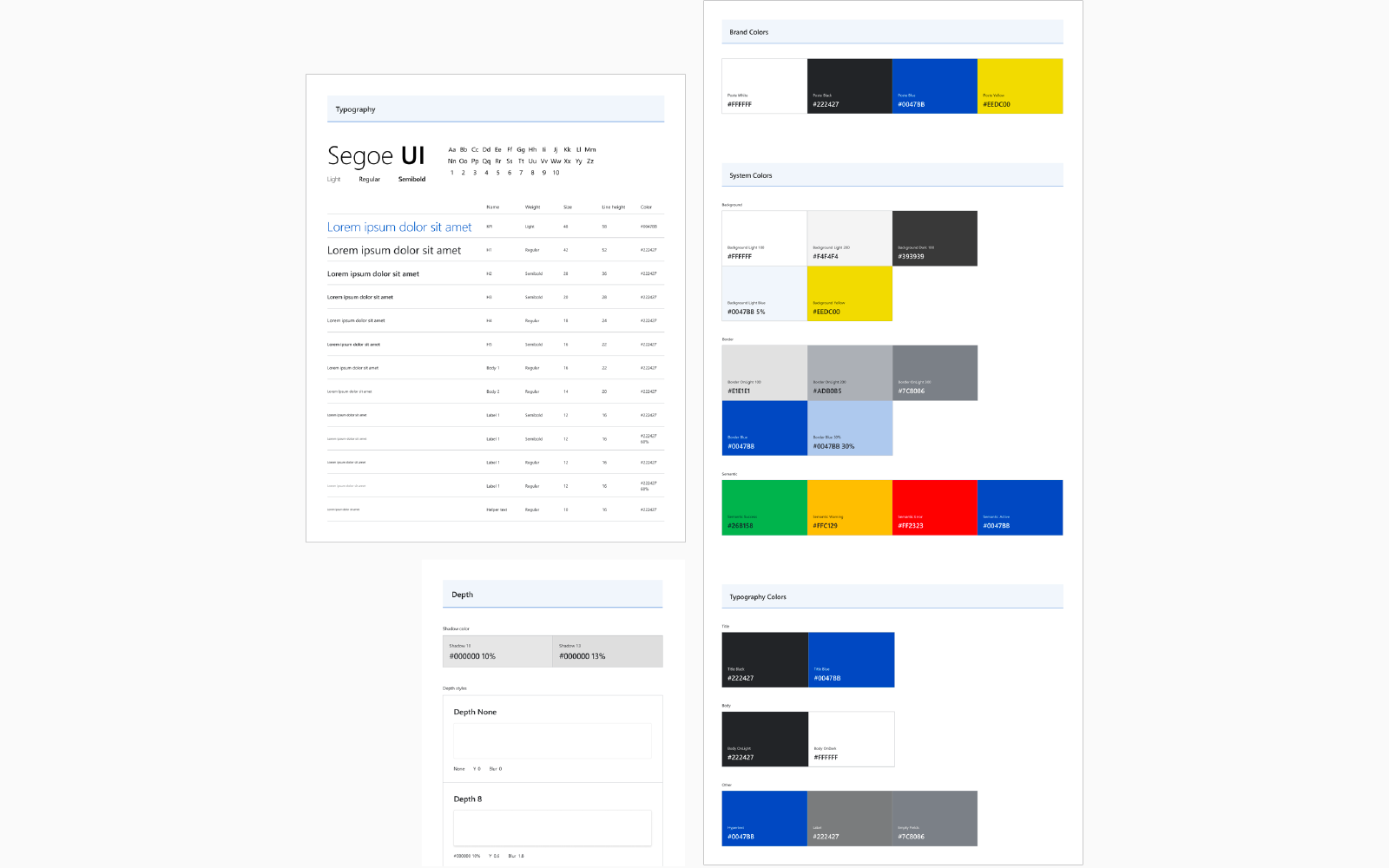
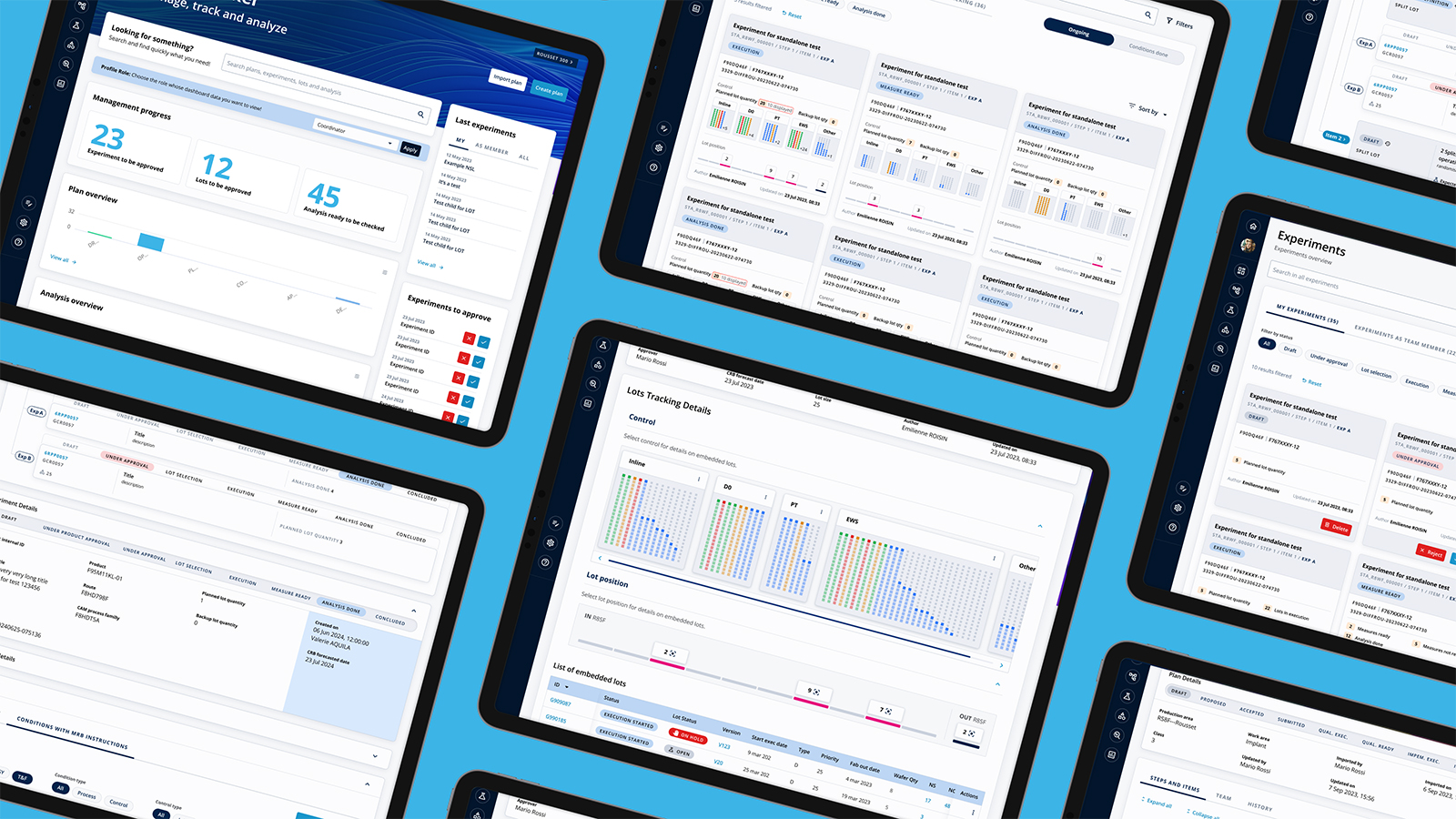
Visual design artefacts